For the Taking Care of Business brief I'll be working with Ryan, Liam, Jamie, and Alex. We had a discussion about what our business should be, how it's different to any other companies, and how we could brand it.
After someone in the group noticed that we all had different hair cuts, the idea came up that we could base our company around the concept of a barbers because of how when you go to a barbers you get your hair cut to your personal specifications and the barber concentrates solely on you, and this is a business philosophy that we could elaborate on. Making use of everyones individual specialities we could use different people to head up and take charge of different sorts of projects, with that person talking to the client and making them feel that they are getting a service personally specified to them. We'd split up the specialities accordingly:
Alex - Branding
Jamie - Screen Design
Liam - Illustration
Matt (me) - Print Design
Ryan - Photography
We planned to elaborate on the concept of a barbers by basing the branding on the distinctive and traditional image of the red and white barber pole and decorating our studio in the distinctive style of a barber shop so that clients are reassured about the concept.
The work for the brief will be split up between us in the following ways:
Alex - Branding
Jamie - Mock Website
Liam - Illustrations/Vectors/Icons
Matt (me) - Financial and Logistical planning
Ryan - Photography
Thursday 15 January 2015
Wednesday 14 January 2015
Making Use of the Personal Homepage
I was editing some of my blog posts on my Design Practice Blog a few weeks ago and noticed the section where you can see how many views each post has and where the viewing traffic has come from.
I noticed that a lot of views for my design practice blog come from my personal home page, which doesn't have anything on it. This made me think that there may have been people out there who may have been on my homepage, seen nothing was there, then clicked back. These people could potentially have been looking for someone to do some work for them and I may have missed out.
Because of this, I've decided to start putting work on my personal homepage that I'm particularly pleased with, this will make people more likely to see my work, which could potentially end up with me getting some freelance work. Hopefully.
Monday 12 January 2015
My Folder Design
After completing plans for the designs of my business card and envelope, I need a folder that follows on from them in terms of the design and functionality

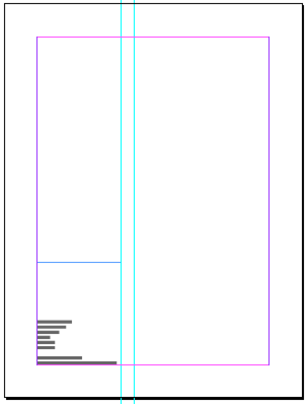
After thinking about how the folder could fit a business card and an envelope into it, I decided that the below layout would work best.
When it's shut the acetate space taking it's usual space in the thinner left column of a golden ratio divided grid. This will allow some variation in the content behind the acetate because it won't be aligned over the pocket.
The left side of the left page will have a pocket for the business card to sit in. Ideally the top of the business card will align with the top of the acetate when it sits in the pocket, although this could be difficult.
The pocket for the envelope will be much bigger than it needs to be, so that after the envelope has been removed, A4 paper can be put in it.
The size of the pocket on the right will also be determined by the golden ratio, although it probably won't be as simple as splitting it into 2 columns and rows though, as then the flaps would be really big and would look a bit bulky and ugly. This is something I can't really judge until it comes to producing the physical copy.
The envelope has a 3cm border around its edges, it seems logical to take this forward for the sake of consistency, and the grid will be divided up from there. The means that the total size of the closed folder will be 27cm x 35.7cm. I took this into InDesign to get the scale right and see if this set up was feasible.


Given that this set up works, I worked on the front and back cover of the folder, based on the layout of the envelope and business card. They'll look like this.


The text on the front has been scaled up from the envelope to fit the width of the column, with the logo being a size where the height fits the row. Contact information is on the back to keep the front as clean as possible, it's done in 11pt text as it fits the column width well whilst also being a fairly standard readable size.
Given that this set up works, I worked on the front and back cover of the folder, based on the layout of the envelope and business card. They'll look like this.
The text on the front has been scaled up from the envelope to fit the width of the column, with the logo being a size where the height fits the row. Contact information is on the back to keep the front as clean as possible, it's done in 11pt text as it fits the column width well whilst also being a fairly standard readable size.
Wednesday 7 January 2015
My Envelope Design
This evening I downloaded a template for one of the envelopes I looked at a few days ago and have been playing with the layout of it, trying to make it distinguishable from the business card but similar at the same time.
The envelope was a bit smaller than I wanted it to be, so I scaled it up in Illustrator so it was 22cm wide, meaning that an A4 sheet can be folded up into three to fit inside comfortably.
Doing this scaled up the tabs as well, so I left a 3cm margin around all the edges so as to ensure any acetate wouldn't show any glued areas. I then split the remaining area into two columns using the golden ratio, put the smaller area on the left and planned to put the acetate on that side, which leaves plenty of space on the right for a stamp. The text was in 18pt Gotham Light as that makes it easily readable and the same size as my name on the business card. I put the logo below this leaving a gap half the size of the margins between the two, and the same 1.5cm gap between the acetate area and the text/logo. This keeps the text fairly central whilst leaving plenty of room for the postage stamp.
Dalton Maag Talk and Workshop
A guy came in from Dalton Maag, a well-established London-based type foundry, to give us a short talk and to do a workshop with us. Whilst speaking to the guy during the workshop I realised the delicacies of type design, and the sheer scale of how many glyphs need to be designed for a modern font, much more so than I realised in Design Principles last year. It has written off "type designer" from my list of future job titles indefinitely.
Key Points From The Talk
"Type is the glue of visual communication"
"It takes, ages to make, no-one wants to pay for it, everyone complains all the time"
Fonts now need to be developed in different languages
Optical alignment is the process of making the tips of the triangular shapes stick up above the x-height or cap height to make it look like everything look like it's horizontally aligned. This is also the reason why circular shapes overshoot the lines as well.
You can use shape groups as shortcuts, like using the "n" as a base for the "h" and "u", but in most cases the counters will need adjusting.
After taking some shortcuts, some letters may require "balancing". For example, if you cut the "n" in half to make the "r" you may need to adjust the curves in the "r".
The Workshop
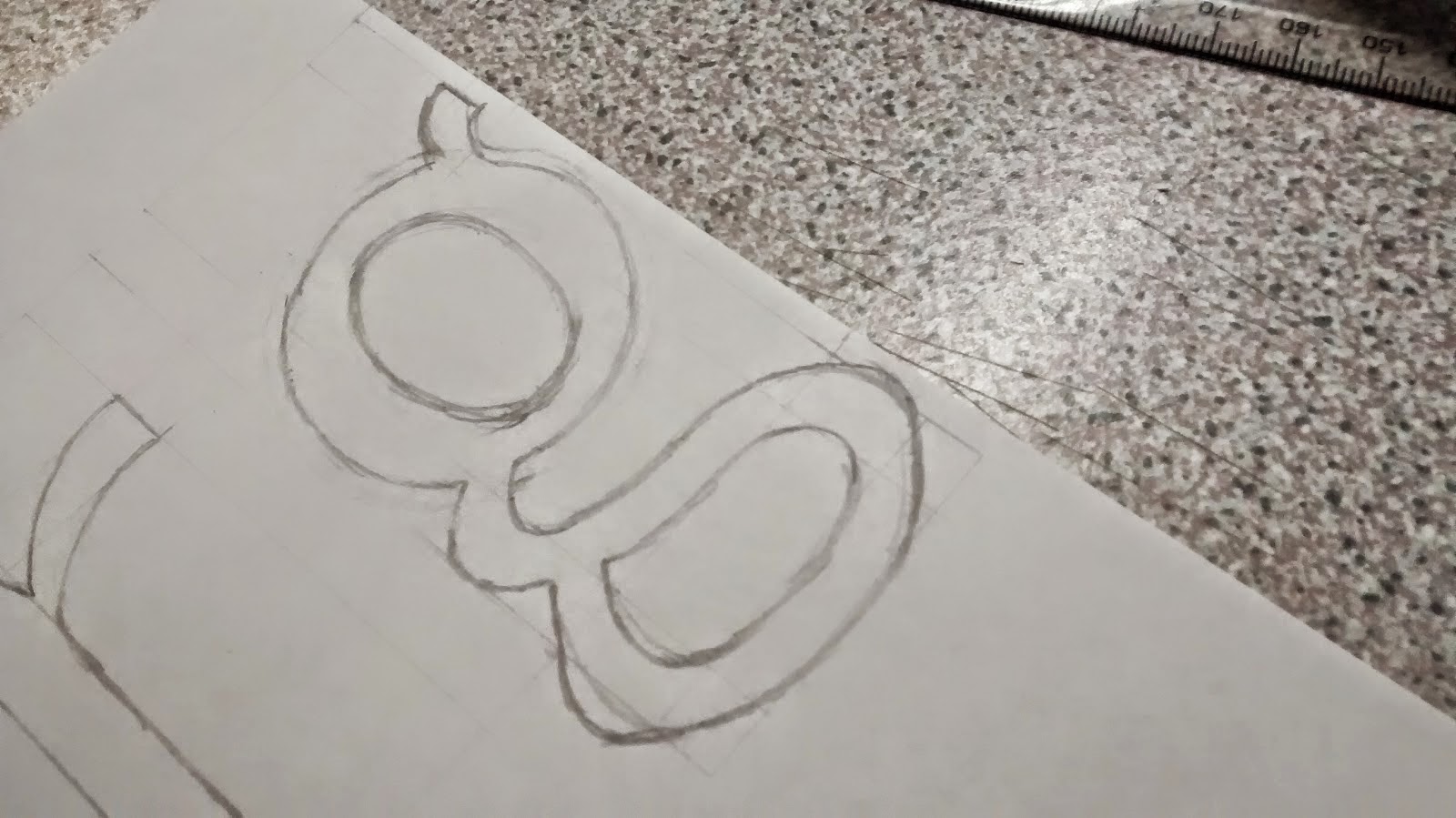
The task we were set was to create letterforms for the word "Hamburg" from two starting points that we could choose from. These were my initial efforts.


I was pleased with this and thought I'd done a good job. But after speaking to the guy he pointed out some areas for improvement, these were:


Key Points From The Talk
"Type is the glue of visual communication"
"It takes, ages to make, no-one wants to pay for it, everyone complains all the time"
Fonts now need to be developed in different languages
Optical alignment is the process of making the tips of the triangular shapes stick up above the x-height or cap height to make it look like everything look like it's horizontally aligned. This is also the reason why circular shapes overshoot the lines as well.
You can use shape groups as shortcuts, like using the "n" as a base for the "h" and "u", but in most cases the counters will need adjusting.
After taking some shortcuts, some letters may require "balancing". For example, if you cut the "n" in half to make the "r" you may need to adjust the curves in the "r".
The Workshop
The task we were set was to create letterforms for the word "Hamburg" from two starting points that we could choose from. These were my initial efforts.
I was pleased with this and thought I'd done a good job. But after speaking to the guy he pointed out some areas for improvement, these were:
- The curve on the top of the a
- The thickness of the a
- The bottom left of the u wasn't as square as it could be
- The g was a very top-heavy
It was this conversation I had with him that made me realise just how much of a perfectionist you have to be to be a type designer, and I definitely don't have the patience for it.
I made some changes, and noticed a clear improvement.
Sunday 4 January 2015
Folder and Envelope Design
Before thinking about how I'm going to extend my branding across the other printed media, I've looked into interesting ideas for envelopes and folders.
Folders
I looked at the blog pages below and found these photos particularly useful.
http://www.creativebloq.com/graphic-design/20-gorgeous-presentation-folder-designs-9134685
http://www.pinterest.com/mjdleicester/corporate-folder-design/

The above photo shows how, rather than having a fold that overlays the image and looks out of place or awkward, if you have a background image printed onto the fold it fits in a lot more discretely.

In contrast to this, having a bright and obvious fold can be quite iconic, especially against a more plain background.

Having a fold that's big enough to have utility in itself opens up more options, such as having space to put a business card and/or an envelope.

Having a method of closing, locking or folding the folder in a skeuomorphic way makes it look like more relevant and appropriate, as well as making it look a bit cleverer.

Having some transparency in the folder makes it relevant because whatever the content of the folder is becomes part of the design. Envelopes
I looked at envelope templates and envelope designs on www.creativebloq.com on the below links, with the below photos being particularly relevant.
http://www.creativebloq.com/design/envelope-templates-2131850
http://www.creativebloq.com/product-design/creative-envelope-designs-2131999


Having an interesting closing or opening mechanism makes the envelope more bespoke, which can leave a better impression on people than a regular envelope. If this can have some element of skeuomorphism or relevance to the concept this improves it even further.
Folders
I looked at the blog pages below and found these photos particularly useful.
http://www.creativebloq.com/graphic-design/20-gorgeous-presentation-folder-designs-9134685
http://www.pinterest.com/mjdleicester/corporate-folder-design/
The above photo shows how, rather than having a fold that overlays the image and looks out of place or awkward, if you have a background image printed onto the fold it fits in a lot more discretely.
In contrast to this, having a bright and obvious fold can be quite iconic, especially against a more plain background.
Having a fold that's big enough to have utility in itself opens up more options, such as having space to put a business card and/or an envelope.
Having a method of closing, locking or folding the folder in a skeuomorphic way makes it look like more relevant and appropriate, as well as making it look a bit cleverer.
Having some transparency in the folder makes it relevant because whatever the content of the folder is becomes part of the design. Envelopes
I looked at envelope templates and envelope designs on www.creativebloq.com on the below links, with the below photos being particularly relevant.
http://www.creativebloq.com/design/envelope-templates-2131850
http://www.creativebloq.com/product-design/creative-envelope-designs-2131999
Having an interesting closing or opening mechanism makes the envelope more bespoke, which can leave a better impression on people than a regular envelope. If this can have some element of skeuomorphism or relevance to the concept this improves it even further.
Thursday 1 January 2015
Building On My Business Card
After looking back at my recent posts and seeing the development of my business card, I noticed that it may be quite expensive and time-consuming to produce, and so created an alternate route that addresses this problem. I also started looking at how I could use the business card as a starting point for the rest of my branding.
Business Card
Looking at the business card, I think that the areas where the acetate will overlap, creating darker areas is quite visually off-putting. This made me consider that when it would be made physical, the folds would give shadows on the white area, which again, won't look nice.
It has occurred to me that the only area of the business card that needs to be layered is the acetate, and I have thought of a way around that. If I print on two layers of acetate one with the plant, and one with the fish, and stick them either side of a piece of thick card with a whole in, there will be a noticeable gap between the acetate, which will remove the need for folds. Printing on the inside of the acetate will create a better sense of depth. This will also allow me to use a textured white stock, which is always nicer than a plain one in my opinion.

This will be expensive and time consuming though, because of all the different layers of stock I'll be using. Because of this I'm going to make another version which will be cheaper and quicker. I'll just double-sided print on a sheet of acetate and back both sides with some white stock. This will still mean the fish is at the front on the front, and the plant is on the front on the back. This will be cheaper and less time consuming, but I'll assess weather the extra time and money is worth it or not when I've produced them.

The Rest Of The Branding
After being happy with my business card I looked into personal branding a bit more in a wider context than just logos in order to get ideas for what other things I should make. I found an excellent blog post, and some of my favourites are below.


Other than the business card, I've decided that I'll make the following things.
Business Card
Looking at the business card, I think that the areas where the acetate will overlap, creating darker areas is quite visually off-putting. This made me consider that when it would be made physical, the folds would give shadows on the white area, which again, won't look nice.
It has occurred to me that the only area of the business card that needs to be layered is the acetate, and I have thought of a way around that. If I print on two layers of acetate one with the plant, and one with the fish, and stick them either side of a piece of thick card with a whole in, there will be a noticeable gap between the acetate, which will remove the need for folds. Printing on the inside of the acetate will create a better sense of depth. This will also allow me to use a textured white stock, which is always nicer than a plain one in my opinion.
This will be expensive and time consuming though, because of all the different layers of stock I'll be using. Because of this I'm going to make another version which will be cheaper and quicker. I'll just double-sided print on a sheet of acetate and back both sides with some white stock. This will still mean the fish is at the front on the front, and the plant is on the front on the back. This will be cheaper and less time consuming, but I'll assess weather the extra time and money is worth it or not when I've produced them.
The Rest Of The Branding
After being happy with my business card I looked into personal branding a bit more in a wider context than just logos in order to get ideas for what other things I should make. I found an excellent blog post, and some of my favourites are below.
Other than the business card, I've decided that I'll make the following things.
- Letterheads
- Envelopes
- Folders
- Belly Bands
These things are all that I need to be able to successfully communicate with people in a way that makes sure everything I could possibly need to send anyone had my branding on it. I don't see it necessary at this stage to make things like badges or stamps. Because all these things are paper-based, it should be easy for me to continue the branding I'm doing at the moment.
Subscribe to:
Posts (Atom)