Monday 23 February 2015

2020 Perfect Vision Ltd

My dad sent me an e-mail saying that he'd been contacted through work by a Design and Photography firm in Leeds asking if the company he works for wanted any work doing. He sent me a link to their website and asked me if I'd heard of them. I hadn't, but I like their work.

2020 is a Design, Photography and Print company in Leeds, their website is linked below.


Their website isn't the stereotypical one page minimalistic contemporary website with full bleed images blurred out, which I like, because it shows that they've considered the fact that their website is aimed at customers not other designers.

Their portfolio is relatively small, but the company has only been running for about 3 and a half years so far. That said, they do currently employ 7 graphic designers, which I would consider to be quite a lot for a young company.

There studio is located in Leeds just off Millshaw Park Avenue near the White Rose Shopping Centre. It's a 6000 square foot warehouse, and they require this because they do all their photography and printing on-site.

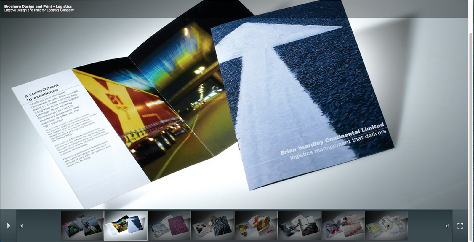
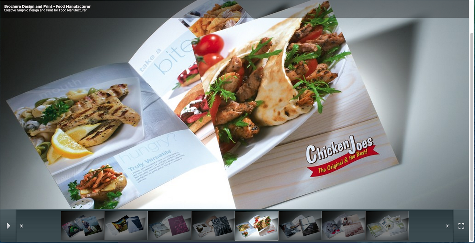
The fact that they do this makes them an ideal company to choose when you need things like catalogues or promotional materials designing, and this is reflected by the work in their graphic design portfolio.


Saturday 21 February 2015

Off The Page Illustration Exhibition

My housemates and I went to an exhibition at Munroe House last night to see the Illustration students work on display. I went despite it not being Graphic Design, because I thought it'd be interesting to see a variety of different styles of work.

I was really impressed with the quality of all the work, and the variety of visual styles on display. It has re-affirmed my thoughts that exhibitions are a place for purely visual things such as illustration and art, whereas taking things like graphic design out of their contexts and putting them in an exhibition such as the Print Festival doesn't really work. I didn't go the the Print Festival this year because last year it wasn't what I thought it was going to be and I wasn't very impressed with it.

Some of my favourite bits of work from the exhibition last night are shown below.


I spoke to the guy who did the American Gods posters, and asked about the intricacies he must have gone through to get the details to screen print well. He told me that it was really irritating and time-consuming, as well as hard to get the ink to print uniformly because of how large the posters were (A2). Prints of all the work on display were for sale, and he said that because of the difficulties he had printing, he hardly had any that were good enough to sell, which wasn't very well thought through given that he was only selling them for £15.

For me, things like this are what cause the boundary between graphics and art. Art is all about the outcome, so it doesn't matter that Joe only had a handful of prints to sell, because it wasn't about selling them, it was about making something that looks really nice, which he died. If you'd have given me the same brief as Joe for the American Gods poster I wouldn't have done anything like that because of how the commercial aspects of it aren't very practical. This isn't a criticism, but it illustrates the niche that graphic design has in the creative industries.

Thursday 19 February 2015

Barbered Design Presentation and Feedback

This was the presentation we showed today. I think it went really well. Below it is some feedback that was given to us by both John and the rest of the group, as well as some stuff we forgot to mention.


Feedback

Is The Name Misleading?
We don't think the name is misleading at all. Anyone who's serious about getting some graphic design work will look into various studios in order to decide what is the right studio for them, and if we are the right studio for them, their research should point them in our direction assuming we establish a web presence.

Isn't It A Bit Masculine, Potentially Isolating A Female Market?
The concept itself has the potential to be quite masculine, which was why the logo and branding was designed to specifically not be masculine, and more concentrate on a mix between traditional and modern design.

Confusion About Pricing
I think it came across that we were only anticipating a total income of £28.50 an hour. I didn't make clear that we were expecting to have between 3 and 5 clients at a time, and the income would be £28.50 an hour per client. 

The Business Combs Are Really Cool
Yes they are.

Things We Didn't Include

We're A Limited Liability Company
Because the numbers in the finances the company could be potentially involved with are quite high, we're not particularly comfortable with them having had no business experience. Picking this sort of company protects us against mistakes financially.

Having A Barber Working In The Studio
One of the benefits behind having a larger, more expensive studio is that we could employ a barber to cut peoples hair in the shop window, with us taking the money made from this as company profit too. This would be very viable because of it being a student area, and having a cheap barber is an attractive proposition. This would also work as a gimmick to create awareness of the company.

Tuesday 17 February 2015

Barbered Design Website, Content, and Business Combs

Over the past couple of days we've been putting together the mock ups for Barbered Design as well as putting the presentation together and making the business combs.

This is a mock-up of the website that Jamie made, it includes the below icons that Liam designed and the photo's that Ryan took.


Ryan also mocked up how the logo would look on social media profiles.


Rather than producing business cards we decided we'd continue the the Barbered them and make business combs. Alex did the work on Illustrator and we went down to the laser cutting and wood-cutting workshops to get them cut out. After a quick crash course in how it worked we got the following outcome as a mock up.


We then got the actual ones cut out, shown below, but we found that the laser didn't go all the way through consistently, so the combs didn't fall out immediately, and will need gently cutting out with a scalpel.


Tuesday 10 February 2015

Discussion About Responsive With Danny

This afternoon I showed Danny the 1st, 2nd and 5th brief I've started for Responsive, which are the 3 I've completed at this point in time. I did this to get some feedback as to if there was any part of my process or blogging that was lacking so I knew where to improve for my 3rd, 4th and collaborative brief.

After showing Danny the design boards I'd made and talking him through my decision making as well as the final outcomes, he commented on how he could see an improvement in my final outcomes from the final outcomes in OUGD504, and how much more contemporary some of them looked, commenting specifically on the more recent brief, the one I did for a creative advertising student.

This is something that I thought was a big step forward for me, as we spoke about the difference in quality between the website and the augmented design brief for last module, and how this is something that has continued into responsive. This makes me feel much more confident in my abilities as a designer.

Sunday 8 February 2015

Wednesday and Thursdays Sessions With Danny and Simon

Last week we had some sessions with Danny and Simon about efficient blogging and design thinking, I think both had a big impact on the way I work, and this will hopefully improve my work.


Since the session on Wednesday I've been working on the Roses Student Awards brief to get a word put into the Oxford Dictionary, and I've definitely noticed just how much more concise my blogging is, which can only be a good thing. At the same time the wording of it is much more confident, which has helped my mindset on the project as I've felt a lot more confident when writing it. This might only seem like a small change, it's one of a few small changes I've made this year that are slowly helping me improve my work.


This session helped me with my design process a lot, which can be evidenced in the RSA brief mentioned above, as I've gone through a thought process to decide what the outcome should be, rather than choosing one right from the off, which is what I had initially done. This is going to increase the relevance of my work if I do this in every brief.

Saturday 7 February 2015

Barbered Design Logistics, Location and Costings

This morning I had a look at potential locations for where the company could be based and had a look at how the finances would work out. 

We discussed yesterday that we think we'd like the company to be based somewhere around the edge of Leeds, with Headingley being a favourite because of how it's a student area and has a lively atmosphere about it because of this.

Given that the concept of the company is based around a barbers shop, a regular office in a big corporate tower block wouldn't be suitable, we'd need a shop style space on a main road so we can show of the decorating, and this is going to cost more. We don't see this as a problem though, as the concept of the company will attract business and make the extra money worth spending

We'd be based at Granby House on Otley Road


The rent is £12.50 per square foot per annum. Based on there being 5 of us that will be working predominantly on computers at desks which doesn't require too much room, and a fairly large meeting area to talk to clients in, based on this guide I found on the internet, 1000 square feet should be plenty. 


This means the yearly cost would be £12,500. Whilst this is more than is necessary for a regular office, we think that it would be worth paying the extra money for a perfect office. I set up this spreadsheet for working out costs


We decided to budget it a £21,000 salary each, which is based on Numiko's salaries. We'd only need one Mac as 4 out of the 5 of us already own one. We decided not to factor in travel and food costs as we feel that's something that we should pay for individually rather than out of the company, especially given that we've allocated a salary each.

Given that we've got about £10,500 costs per month and that income isn't going to be consistent, I based the hourly rate on trying to earn £20,000 a month, as this gives us plenty of room to turn a profit even if we're not working at full capacity. This correlates to an hourly charge of £28.50. Charging this relates to a yearly income of about £230,000 based on 46 working weeks, as according to the governments website:


Going back to the problem that business and cashflow is unlikely to be constant, assuming that we're working at least two thirds capacity all the time (which is very achievable), our income will be about £153,000 leaving a minimum profit of roughly £27,500

The company would be a limited company as this protects us personality more from any issues that would arise if the company were to fail.

Friday 6 February 2015

Group Discussion + Discussion With John

In our groups meeting with John today we discussed with him the concept of our business and showed him the branding that we'd got so far. 

John suggested that we'd put the cart before the horse in this project so far because we'd not sorted out what sort of company we'd be or any of the logistical things like that. This is my fault because the logistical side of things is my responsibility. 

We did know enough about our company to give John an informed understanding of it though, as before the meeting with him Liam and I had run through some questions Alex presented us with that might be things that John brought up.

A summary of the information that we relayed to John is below:

  • Our target market would be small businesses and individual entrepreneurs in order to establish long term working relationships.
  • We'd reach them through social media and networking events and, would  entice them to approach us by offering reduced rates to first time customers.
  • The service the company would offer are Branding, Web/Screen Design, Print Design, Photography and Illustration.
  • The advantage that we'd have over competitors would be that each client would have an assigned member of the company as a point of contact. That person would be assigned based on the nature of the project, for example, if it was a branding project Alex would be the point of contact. This would encourage communication within the company as we'd all have to be aware of what was going on incase someone was ill or unable to work for any reason.

Wednesday 4 February 2015

Working With A Creative Advertising Student

Over the past couple of weeks I've been working for my friend Beth, a Creative Advertising Student, to produce some mock ups for her WWF brief entry in D&AD.

I was really sceptical of working with Beth, as I didn't want to jeopardise a friendship by mixing it with a working relationship, as disagreements happen, as has been the case when I've done collaborative briefs in the past.

Despite this, there were no disagreements whatsoever and we got along really well throughout the process. 

The difference in this case was because I was working for Beth, not with her, which meant that the concept had already been dictated to me, and I didn't have to negotiate it with anyone, which allows less room for arguments. On the reverse side of this, when it came to making decisions regarding the design elements of the project, Beth had little reason to disagree with me, because I was more much knowledgable and experienced with these things than she was, which hasn't been the case in the past.

After this experience I would have no hesitations when asked to work for someone again rather than working with them, despite the loss of influence that comes with it. This isn't something I see as a problem as long as I'm continuing to do individual work.

Tuesday 3 February 2015

Group Meeting and Logo

Ryan, Jamie, Liam, Alex and I met up this lunch time to fill out and sign the sheets that bind us together as a group.

Photo's of the signed forms:


This evening Alex showed us load of iterations of how the logo could look, building on it each time using the suggestions that the 4 of us through at him in our group chat on Facebook. This shows the progression of the logo:


We think the logo works well because it has a classic look about it with a modern twist informed by the nature and concept of the business. The contrast between the use of a strong and bold serif font with a fine and minimalist sans serif gives the right sense of balance between tradition and contemporary. The imagery backs up the concept whilst still maintaining the basic idea that the company is a modern design company.